
This blog post reports on work-in-progress within the DfG course! The post is written by the group dealing with the Ministry of Interior’s brief on ‘Strategy for expatriate Finns’.
Group 3B: Amir Tahvonen and Savannah Vize from Creative Sustainability, and Hannah Roche and Shuaijun Zhang from Collaborative and Industrial Design.
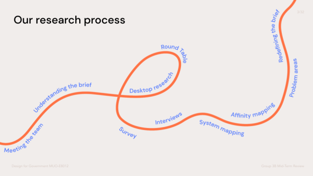
During the past three weeks, after getting to know our teammates and familiarizing ourselves with the brief, we started gathering desktop research and conducted a series of interviews both as a group and with our supergroup.
After receiving more than 800 responses from our supergroup survey, we started to run some interviews with expatriates from around the world in order to get more fruitful and multicultural insights and qualitative data. The interviews were conducted with Finnish expats, non-Finish expats, service providers (both Finnish and international) and Finish administrators. Apart from this, we also collected some data by running asynchronous interviews through email and Facebook for those with busier schedules.
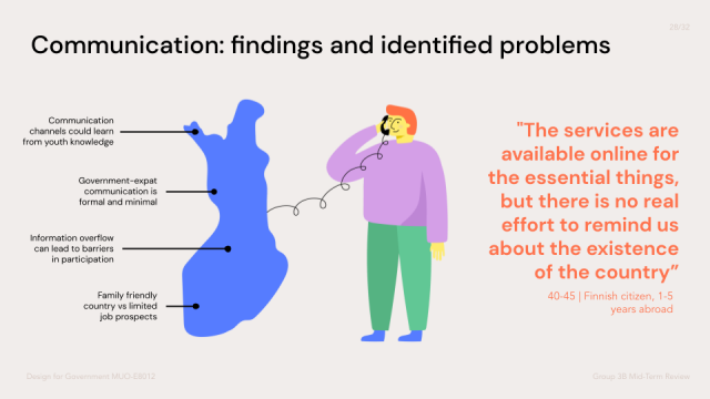
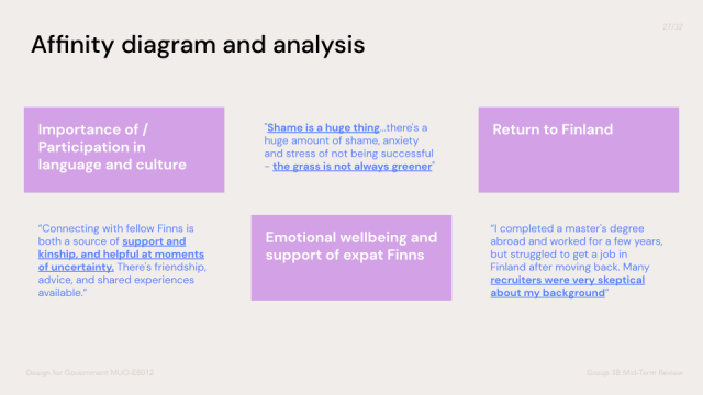
After gathering our data, classifying it became tricky, which is where the affinity diagram played a role. We managed to cluster six categories of data in an organic way since we just grouped it and then came up with the categories. In the affinity diagram, we attached the most importance to three categories: participation in language and culture, emotional wellbeing and support, and return to Finland. Data in these three categories was frequently mentioned by our interviewees and helped us narrow down our interests and focus our brief.
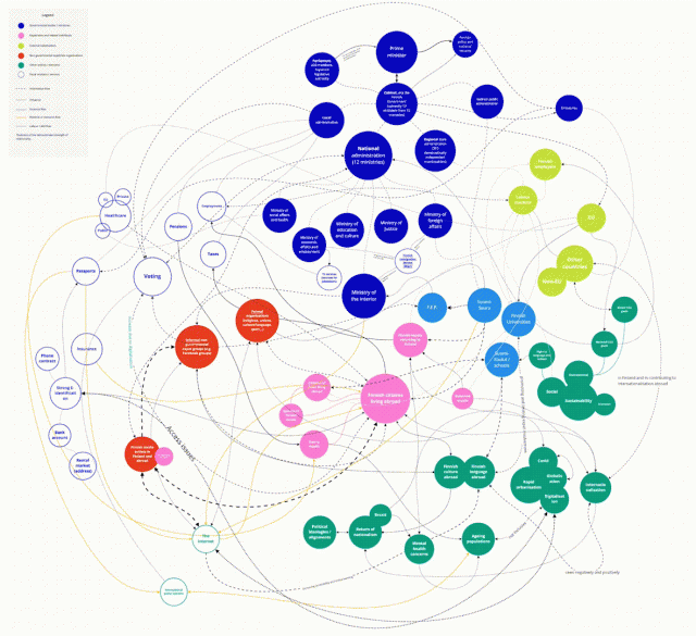
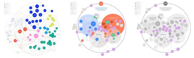
Another important element in our analysis was the system map, which helped us have a clearer understanding of what kinds of stakeholders are involved and an overall perspective to see what is happening among them. First, we tried to list out every single related element we could think about, ranging from the structure of stakeholders to some intangible factors. Apart from that, we tried to figure out all the relationships between each element, which is why the initial system map looks chaotic. To narrow it down, we got rid of many unnecessary elements and routes and used shades, different colours, different sizes, and different positions to make the refined system map. To keep it clear and focused, we also created a black and white version focusing on emotion to show where our interest lies as a group.
In the fifth week, we had the mid-term presentation. It was helpful to get feedback from our clients: some of our insights were acknowledged but some were not. It meant that not only do we need to rephrase our findings, add and remove something, but also try to find a way to persuade the value of those insights we attached great importance to but did not get attention from our stakeholders. One thing that we found useful for collaborative presentation making was that Miro is an efficient platform for teams to make a refined sketch of the presentation since there is no limitation of the canvas size on those traditional PPT tools.
“How might Finland maintain ‘invisible string’ relationships to Finns living abroad, in order to support their emotional and practical needs, and keep a line of communication open should they need it?”
“What services could be provided to better support the diverse needs of returning expatriates, especially regarding employment, qualifications and reverse culture shock?”
These are our refined research questions after 5 weeks of Design for Government, slightly repositioning the original government brief to better suit our interests. As we move into the design phase of the course, we are going to work on how to better define the problem and users more specifically.
—